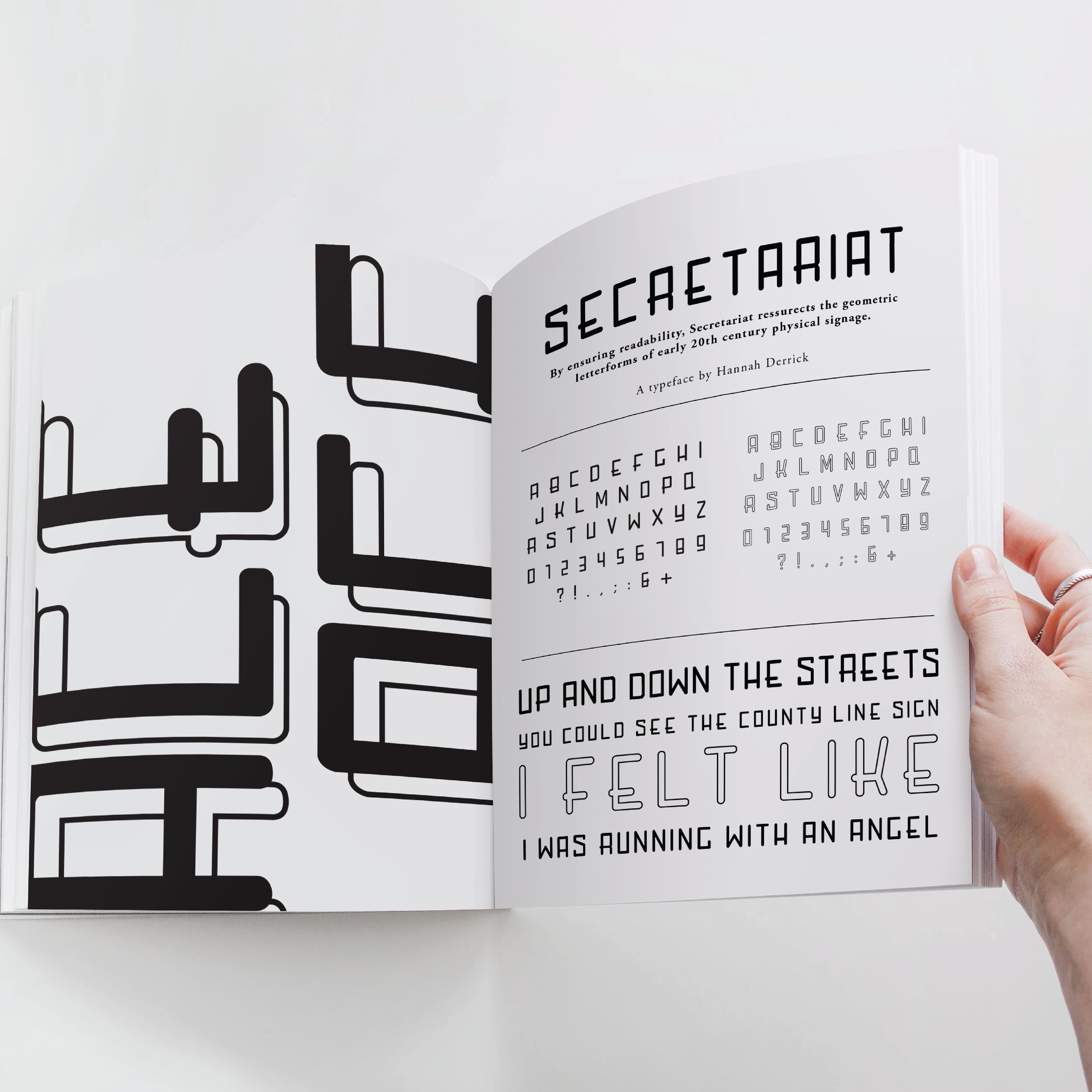
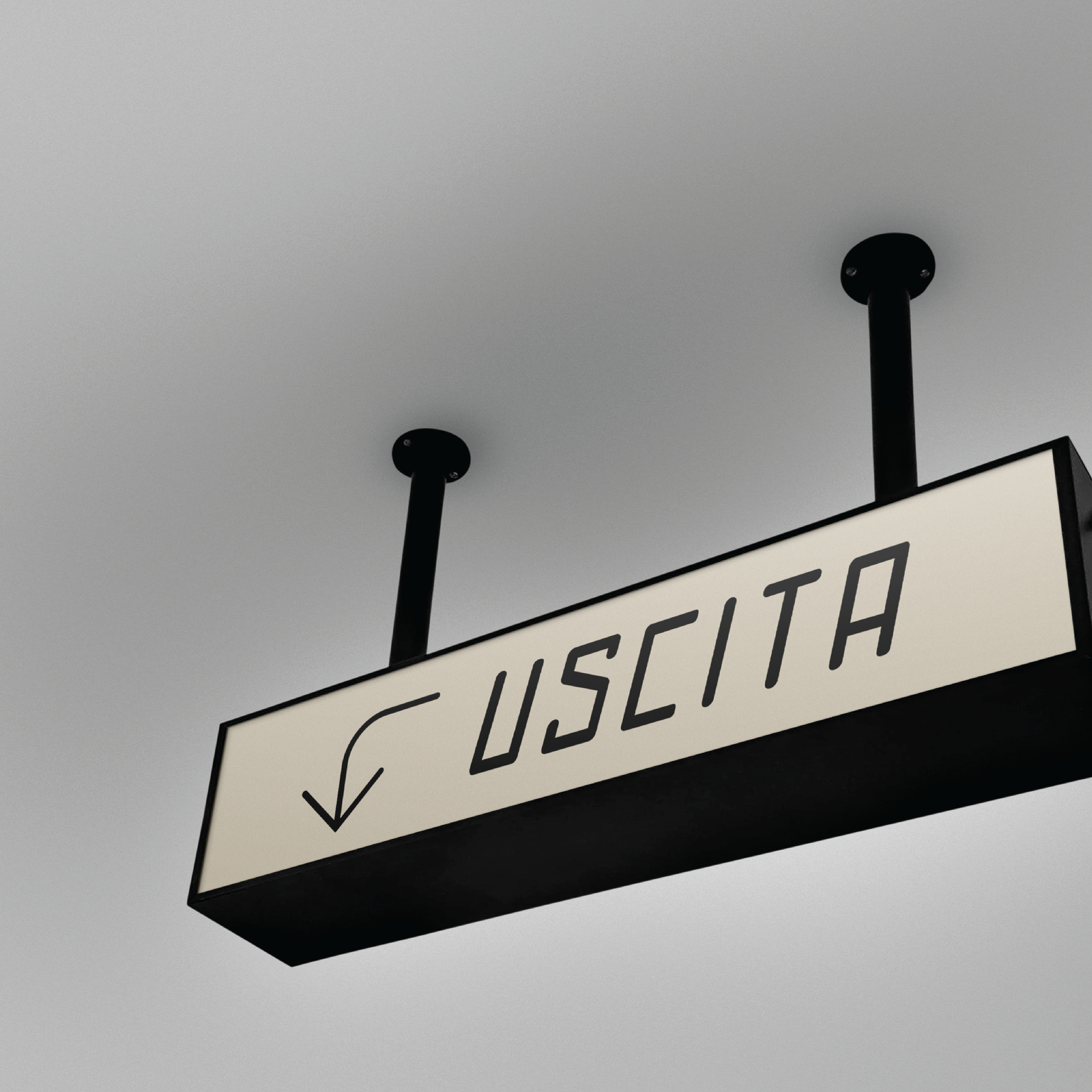
SECRETARIAT TYPEFACE
Derived from signage featured in the Santa Maria Novella train station in Florence, Italy, the original specimen was limited to seven characters distinguished by their elongated structure and anchored baseline. The original signage read “Segretaria” meaning secretary or assistant. This is the source of inspiration for the name of this typeface, "Secretariat."
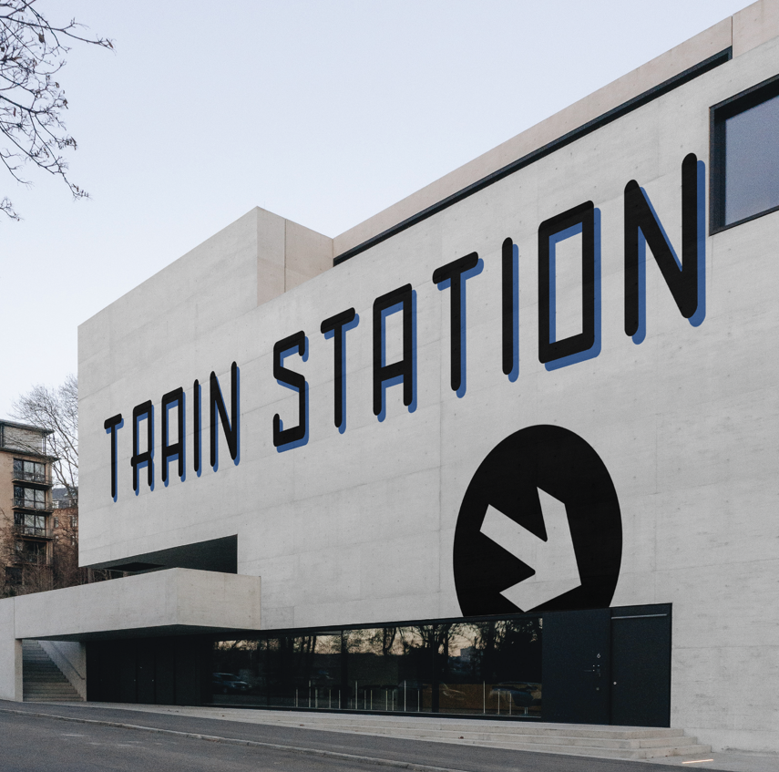
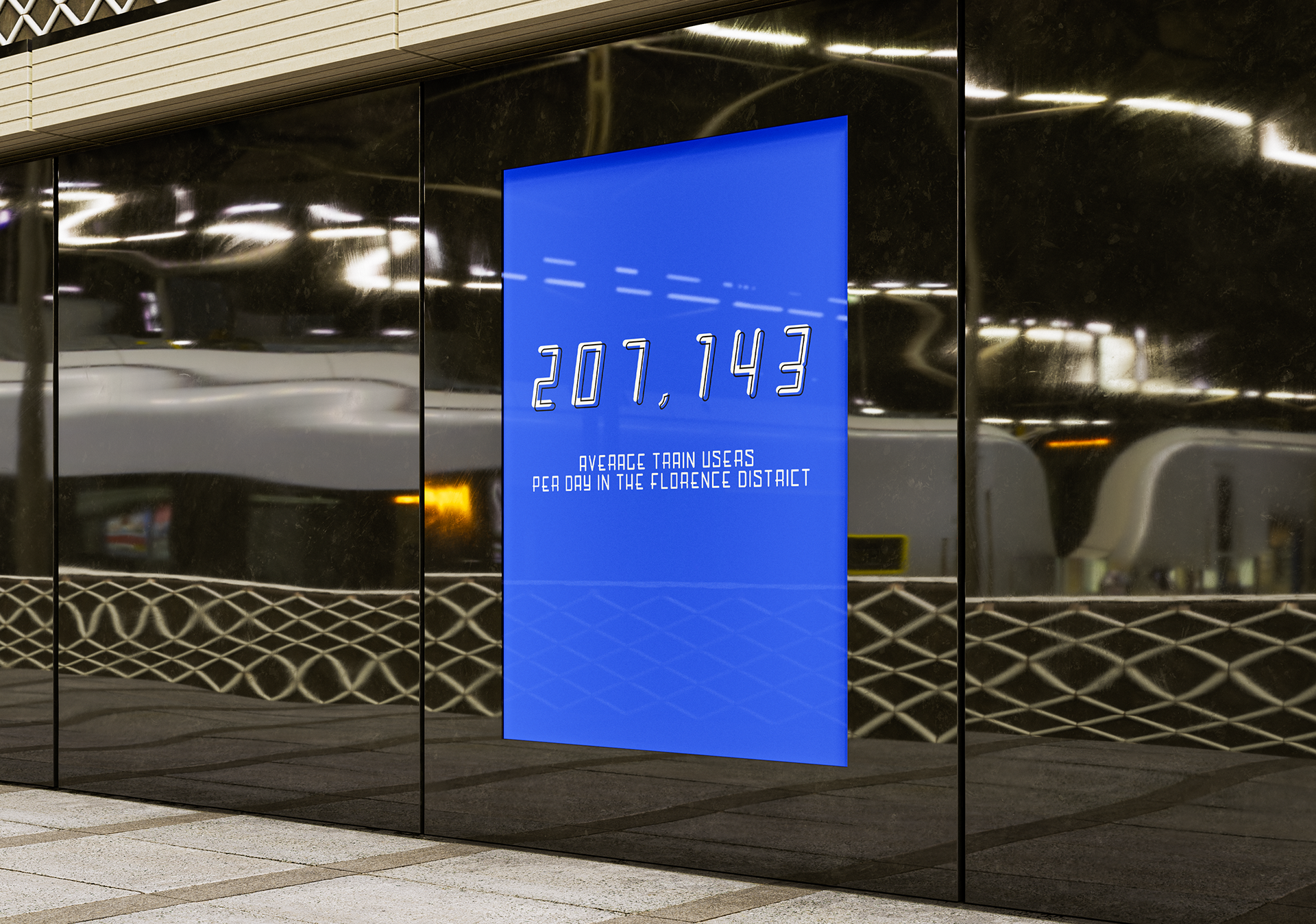
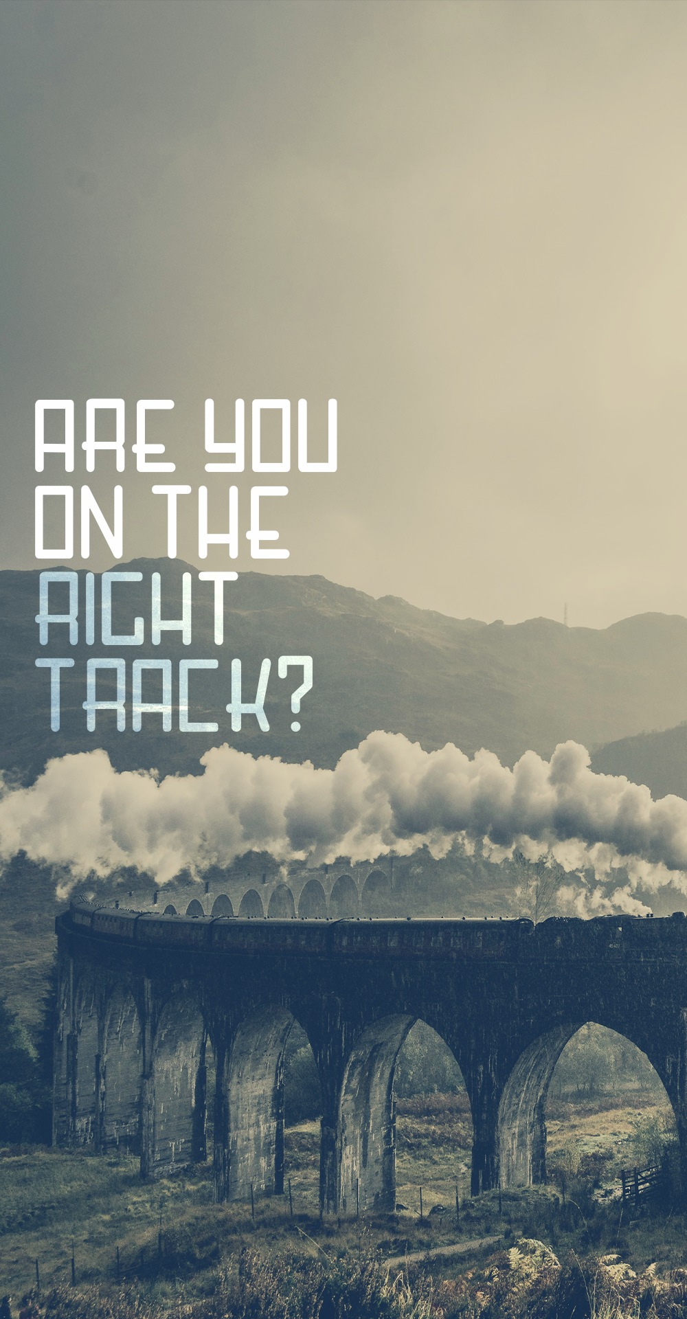
Train stations in Italy were packed with bespoke signage and way finding elements that embodied the novel approach of constructing type with geometric structure. To be decipherable while traveling quickly, legibility of form was the primary objective of the original creators, and I desired to honor that consistency and legibility. This type is meant to be largely displayed, specifically on signage where people are traveling at a high rate of speed.
This original type is believed to have been from the 1930s period. Although it was not a working typeface back then, now it is digitally resurrected for contemporary, long-lasting use.
{This project is for educational purposes only.}
Software
Adobe Illustrator, Adobe Photoshop, Fontself
Deliverables
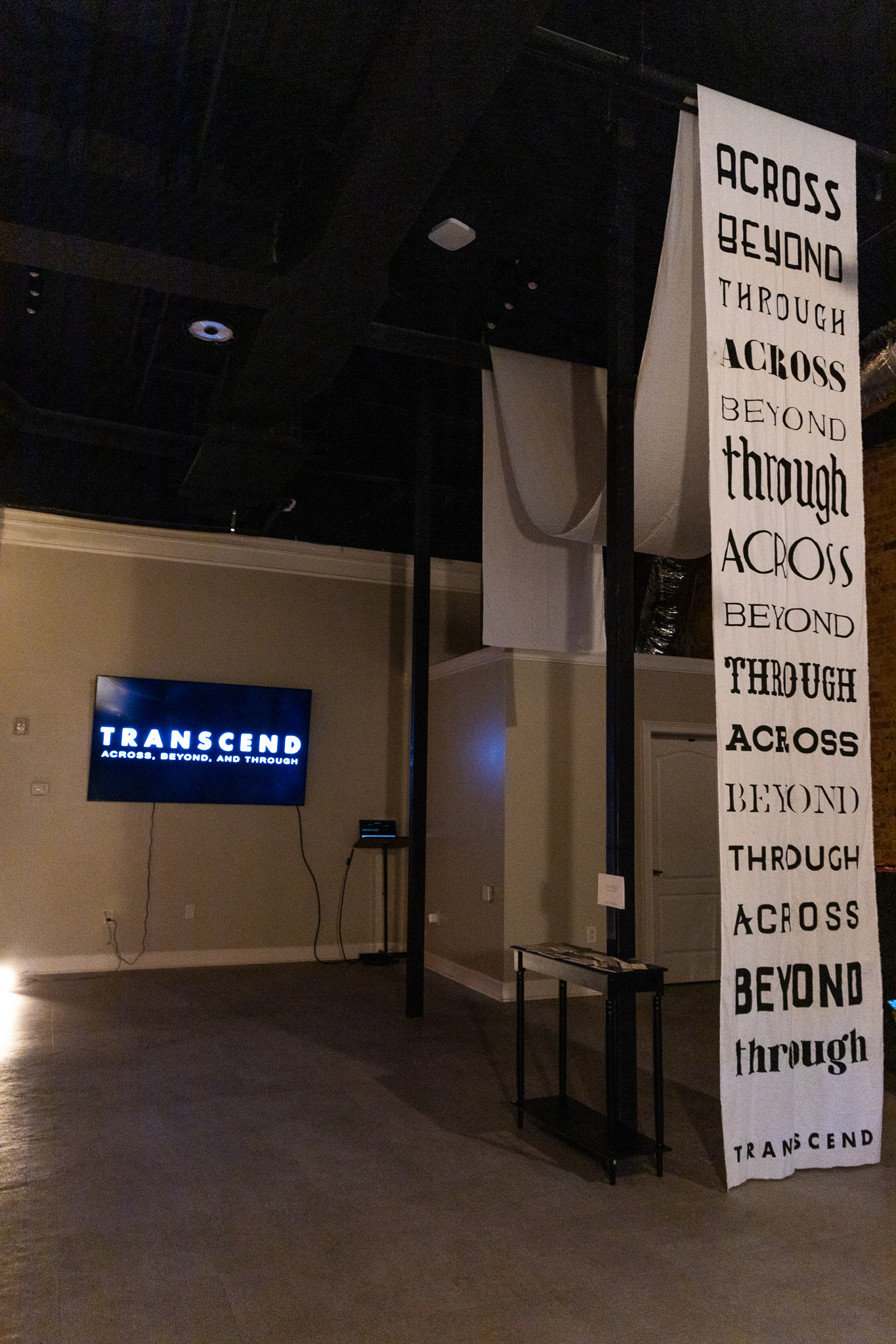
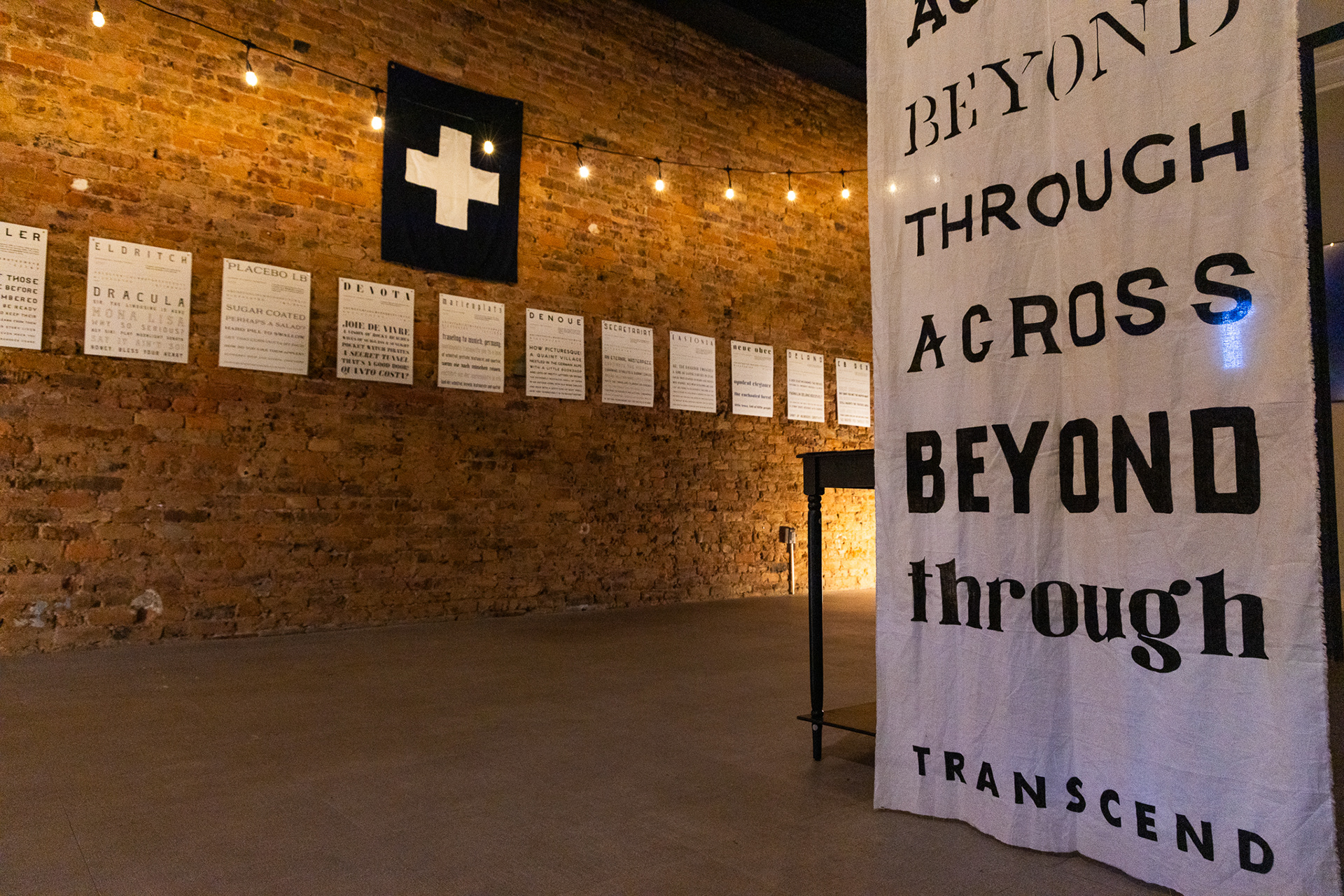
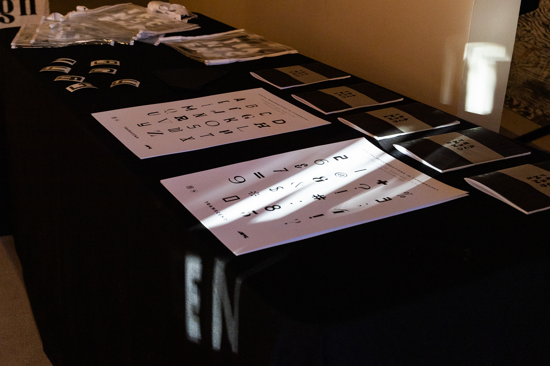
Visual Identity System, Mockups, Environmental Design, Wayfinding Elements of Design, Final Exhibition Design, Publication
Collaboration
Worked as an Exhibition Coordinator
Collaborated with members of AU Type Foundry to coordinate Typography Vol. 3 Exhibition and Publication
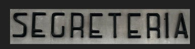
Original source image for Secretariat


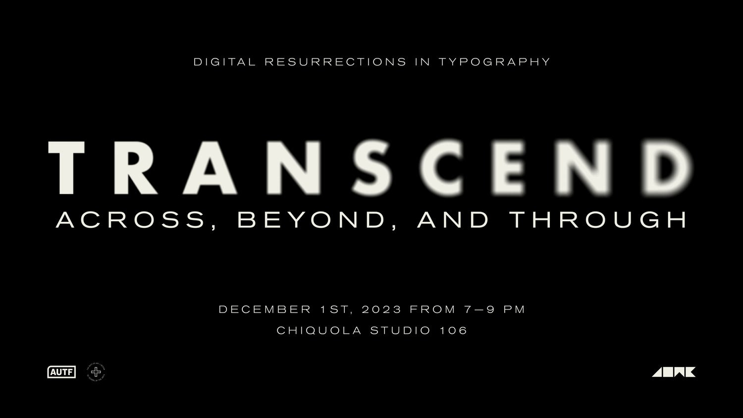
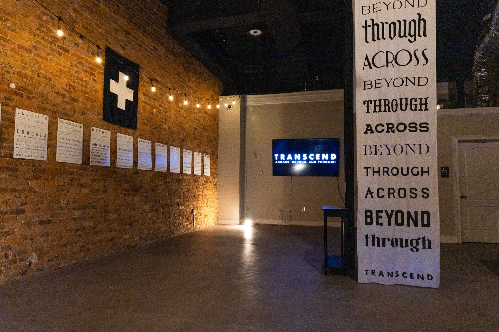
"TRANSCEND": ACROSS, BEYOND AND THROUGH
TRANSCEND is an Exhibition held in Downtown Anderson, SC. Bringing life to history once lost, this exhibition was created to display typefaces from the AU Type Foundry Resurrections class. These beautiful and forgotten forms have been resurrected, renewed and brought to life again.